站长资源网页制作
有创意的关于我们网页页面设计
简介Unique “About”-Pages A great way to distinguish yourself from the crowd is to have a truly unique about page. Dustin Curtis has taken a tr
Unique “About”-Pages
A great way to distinguish yourself from the crowd is to have a truly unique about page.
Dustin Curtis has taken a truly unique approach to the about page. What he has created is a death clock of sorts; a timeline of his life up until now and to beyond. It’s an about page that truly speaks to the designer’s capabilities and creativity. It accomplishes the most important thing about a website and a great about page - it’s something you won’t soon forget.

While the content is slight, the “Floating Asian Kid” gag below is cute. Move your mouse around the graphic to see why. It is both memorable and unique

Quomo has taken a very unique approach to the about page - a series of full-body action shots on a horizontal carousel.

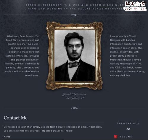
Jared has taken a very clever approach to the self portrait (quite literally).
Mark has put his face on Mount Rushmore.

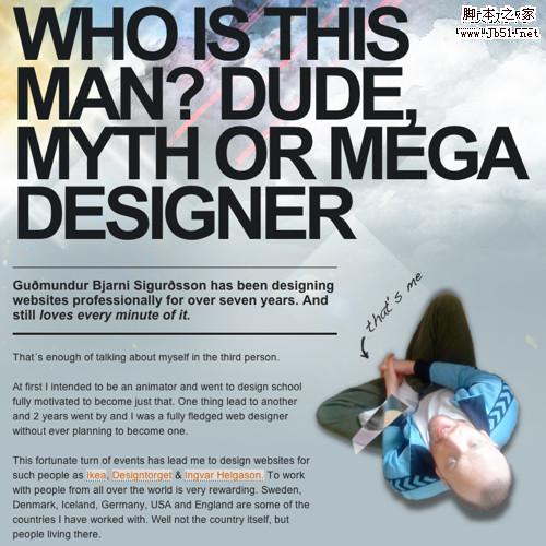
Guðmundur has used big typography and an interesting perspective for his portrait.
 Big Photograph
A large photograph of yourself can leave a lasting impression in your users minds if it’s done well.
The more we use computers to communicate, the less face-to-face interaction we get. This is why David DeSandro’s about page is so effective. His headshot is as big as any I’ve seen on an about page makes you really feel as thought you’re meeting a real person rather than some web designer on some website. Once the introduction is made, you can easily connect up with David via his social networking presence or the handy contact form below his picture. It’s worth noting his about page is well organized as well.

Janis’ about page is short on copy but big on artistic design. You get a good impression in short order.

Subtraction.com, in addition to being one of the coolest domain names ever, is a picture perfect study in minimalism. Khoi chose an incredible picture for his about page and organized his biography into an easily digested format. It doesn’t hurt that he threw his adorable black lab in there for good measure.

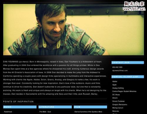
Aside from having an incredibly awesome domain name (unstoppablerobotninja.com), Ethan has a great about page too.

上一页12 3 4 5 6 下一页 阅读全文
A great way to distinguish yourself from the crowd is to have a truly unique about page.
Dustin Curtis has taken a truly unique approach to the about page. What he has created is a death clock of sorts; a timeline of his life up until now and to beyond. It’s an about page that truly speaks to the designer’s capabilities and creativity. It accomplishes the most important thing about a website and a great about page - it’s something you won’t soon forget.

While the content is slight, the “Floating Asian Kid” gag below is cute. Move your mouse around the graphic to see why. It is both memorable and unique

Quomo has taken a very unique approach to the about page - a series of full-body action shots on a horizontal carousel.

Jared has taken a very clever approach to the self portrait (quite literally).

Mark has put his face on Mount Rushmore.

Guðmundur has used big typography and an interesting perspective for his portrait.
 Big Photograph
 A large photograph of yourself can leave a lasting impression in your users minds if it’s done well.
The more we use computers to communicate, the less face-to-face interaction we get. This is why David DeSandro’s about page is so effective. His headshot is as big as any I’ve seen on an about page makes you really feel as thought you’re meeting a real person rather than some web designer on some website. Once the introduction is made, you can easily connect up with David via his social networking presence or the handy contact form below his picture. It’s worth noting his about page is well organized as well.

Janis’ about page is short on copy but big on artistic design. You get a good impression in short order.

Subtraction.com, in addition to being one of the coolest domain names ever, is a picture perfect study in minimalism. Khoi chose an incredible picture for his about page and organized his biography into an easily digested format. It doesn’t hurt that he threw his adorable black lab in there for good measure.


Aside from having an incredibly awesome domain name (unstoppablerobotninja.com), Ethan has a great about page too.

上一页12 3 4 5 6 下一页 阅读全文
上一篇:整洁漂亮的网页设计的4项原则